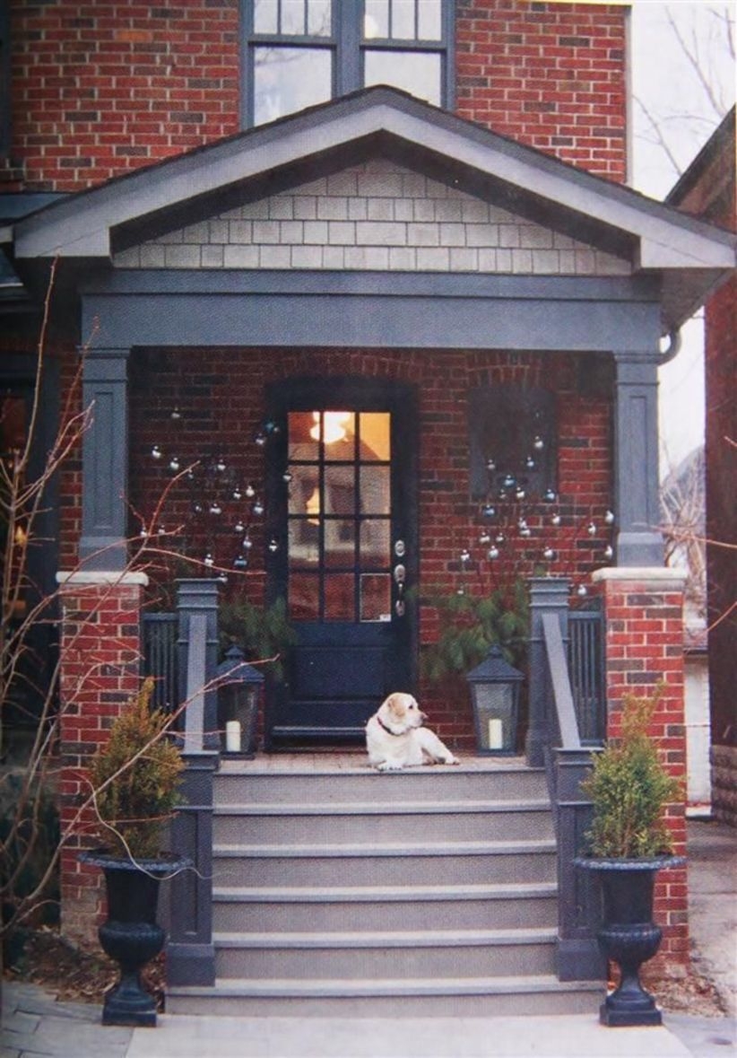
The basic exterior look of your home depends on two main elements: the house and the yard. Learn to integrate these elements together, so that they appear like natural extensions of each other. If, for example, you decide to use landscaping and ornaments to accentuate your front lawn, use a simpler design for the actual house, so that both elements work together rather than compete against each other. Experiment to find which element is stronger (not all lawns are created equal), and use the other to bring attention to it. At the very least, make sure that your house looks like it belongs on your lawn, and wasn’t just plopped there by some kind of giant accident.
It’s a Landscape!
One of the most underused tools in exterior decorating is the actual look of your neighborhood – both manmade and natural. Many homeowners focus so much on just their own homes that they forget to take a step back, quite literally, and look at their homes from a distance. This means that they are blind to the look of other houses, and the general environment, of their neighborhood. Don’t make that mistake.
Here’s a tip: take some photographs of your home. Not only are they great mementos (and start to achieve nostalgic status in a few years), but they flatten the view of your home so that you’re forced to see the background as well as the foreground. On these photos, look below, around, and above your home to see what colors, shapes, and objects dominate. If there are jagged, snow-capped mountains in the background, for instance, take that into account, and use rounder, darker colors to create contrast. If your home is surrounded by trees, use earthy tones to mask elements that you don’t want catching anyone’s eye.
Avoid the Black Sheep
Some homeowners, in an attempt to be different – and under the assumption that everything different is automatically good – go overboard with differentiation, and create a house that sticks out like a sore thumb rather than as the best of the bunch.
A good example is roof color. In some subdivisions, and even in some small towns, there are bylaws in place that limit the type of shingle a homeowner can have (or even enforce a certain color!) in order to create a sense of visual, neighborhood cohesion. However, simply because an area does not have this type of restriction does not mean that you should slap a batch of neon green shingles on your roof just to stand out.
In many circumstances, it is often desirable to mimic some of the existing mood of a neighborhood, rather than reinventing it. If your entire street consists of brown-roofed homes, perhaps you should look into a brown roof as well – and show off your creative side on another part of the home! Which brings us to…
The General Rule
The whole point of exterior decorating is to make your home look better than the houses around it. In order to accomplish this, it has to be different from its neighbors. Use your yard and the look of your house, as well as the environment around it, to achieve this goal. However, keep in mind that not every house that sticks out actually looks good! Remember, the best sprinter in the world is not the one who can pole vault the highest.
In other words, you want your home to be all the things that the neighboring houses are – but to be them better. Do not go so overboard with changes (like neon green roofs!) that your house stops looking like a house.


